
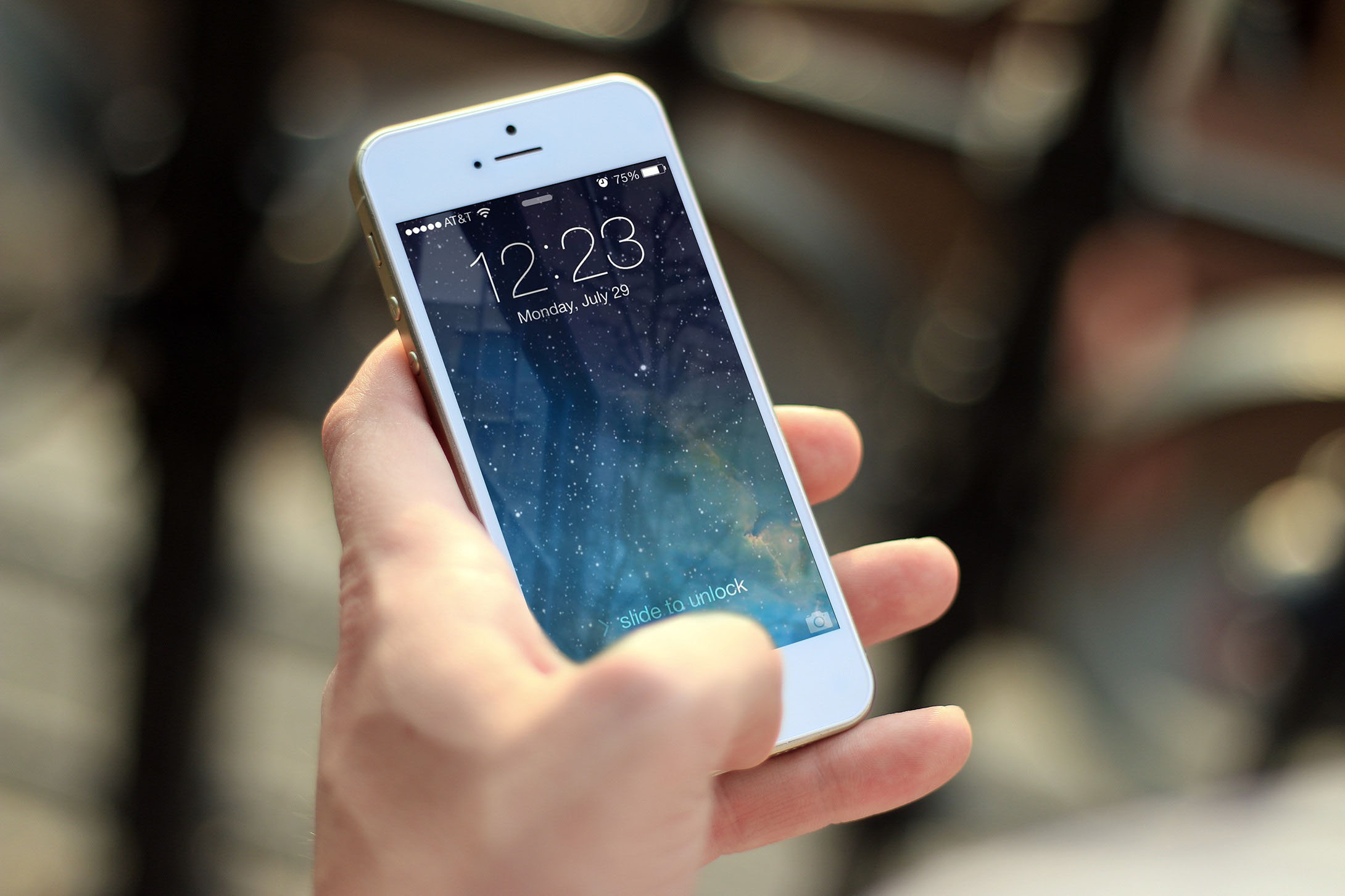
Mobile first has become a popular trend within the UX design and development communities. Many companies caught on to the mobile-first trend awhile back. Google surfaced their mobile-first strategy in 2010. As you've probably guessed from the name of this approach to site design, Mobile-first means designing an online experience for mobile before designing it for the desktop web or any other device. In the past, when users’ focus was on the desktop Web, mobile design was an afterthought. But today, more people are using their mobile devices for online shopping and social networking than ever before, and most companies are designing for mobile. Mobile firstrequires a new approach to planning, UX design, and development that puts handheld devices at the forefront of both strategy and implementation. The digital landscape has changed, and companies have realized that consumers are now accessing more content on their mobile devices than anywhere else. To understand the concept of mobile first design better, you should know the two phrases below first.
- Responsive Web Design (RWD)
Responsive web design is a web design method that enable web to fit to the screens of different devices automatically, displaying the content in a way that people feel comfortable. This greatly reduces users’ operations like panning, zooming and scrolling when browsing the web. 2 “Progressive Advancement” & “Graceful Degradation” These two concepts were put forward before responsive web design. In order to make web or application interface display reasonably on different devices, designers provide customized versions of product for different ends. Progressive Advancement means that when we design a product, first we build a version for relatively lower browser (like that on a mobile phone). This version includes the most basic functions & features. After that we tend to the advanced version for a tablet or PC, which is created by adding interactions, more complicated effects, etc. on the basic version for a better user experience. “Graceful Degradation”, on the contrary, starts the product design from an advanced end like desktop and builds a version with well-rounded features at the beginning. Then designers make the product compatible to mobile ends by cutting some functions or contents. Progressive Advancement has won the game for now as far as I can see. If UI/UX designers start a product design with its desktop version, they will inevitably want to make use of most of the advantages of the advanced end. For example, the hover effect which is supported by a cursor mouse; HD images & complex charts which can display normally only when there is a recent bandwidth. In this way the designers will make efforts to complete an amazing desktop version and only to find it can hardly be adopted on a mobile end unless they give up a lot of beautiful ideas. If so, the mobile end version will be more like an afterthought, an incomplete product which’s been watered down. But if we take the mobile end product design as a starting point, under the restrictions like bandwidth, screen size and so on, designers will naturally seize the key points of a product, head for a lean & neat product with prioritized features. When the platform is expanded to a tablet or PC, designers are able to take advantages of the unique features of these advanced ends to strengthen the product step by step. This might be the main reason that progressive advancement strategy is widely used. What the need to use it?Except for the victory of progressive advancement against graceful degradation as mentioned above, we have more tangible reasons to believe that mobile first principle is important in product design. That is, the exploding of mobile use.
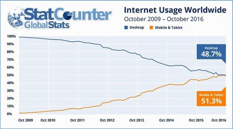
- Mobile internet usage has surpassed desktop usage in 2016.
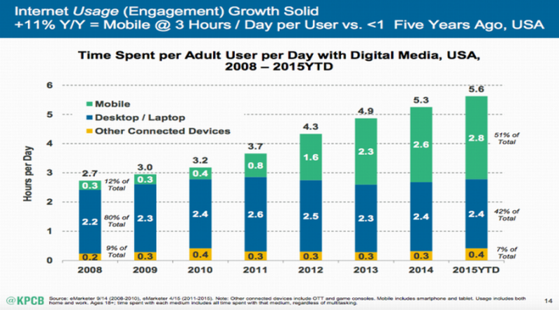
- People have spent more and more time on internet from mobile ends.
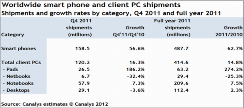
- Early in 2012, smart phone sales have overtaken PC sales.
Technologies that has mobile-first:Over time, mobile has proven to be a pervasive technology, so much so that the term “mobile-first” is going to be soon replaced by “mobile-only”. Despite all the benefits mobility promises, adoption of mobile platforms has been slower in enterprises as compared to the consumer segment. Now that even “instantaneous” is not considered “fast enough”, businesses are willing to adopt innovative enterprise mobility solutions to keep up with the pace at which technology is evolving. Here are the technologies that are not only gaining consumers’ attention but also attracting enterprises towards mobility:
- Enterprise app stores
- Cross-platform app development
- Mobile application streaming
- Big data visualization
- AI-based Chabot’s
- Augmented Reality
- MBaaS
- Security
- Adaptive security architecture
- Ambient UX
- The bottom line